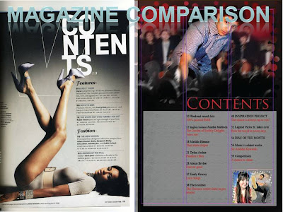
Now, my contents page is marvellous and holds great editing truly time taken but… holds too much of one peace meaning that the effect of bubbles dithering the image to the background is used as a cover-up of not knowing another way to blend into the background and should have spent 2-4 days thinking and experimenting on new ways to do so if needed as it is worth the time. This magazine I picked out though random shows sophistication in text and imagery and my magazine show try to adapt these features. Again with such levels this image shows what’s needed showing emotion is and making the background visible and able to let text to stand upon it easily, also the change of colour though having a down side of stepping out of the house style is good as it reassures male they are also the audience but could now inconvenience females, this colour also is used for without it the content page would not be as prominent and would leave the magazine with the same effect as all the other pages which could be rather boring, also most would have missed this key point NO PAGE NUMBER this is of great discomfort, also for this editor found it hard to mix the colours with the background it seems he simply created a thick box which is rather displeasing and like the other magazine should have the colours fading in.


No comments:
Post a Comment