AS media blog..wish me the best!
Hello...what's up?
Tuesday, 8 December 2009
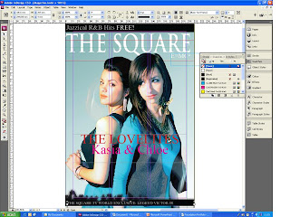
INDESIGN FRONTPAGE
When creating my music magazine I was to make sure that it attracts attention easily and gets consumers to buy it; especially, because of its ingenuity & love affair between sisters. I managed to do this because most of my articles were rather lenient, mature yet as a teenager would enjoy. The name of my magazine was displayed in a specific typeface, but different from the idea before as I was to make it bolder and in depth but only realized that it creates a less attractive and visible mast head… but in the end at least it’s recognizable and unique. The masthead is usually used on the contents page inside as well as the front cover, and as a logo for advertising and branding purposes, so I followed it on words by making the text “contents” in the same text as my masthead. In my front cover I stressed that my model had to be making full eye contact. I have seen that there are in some cases where cover lines run over an image that has a lot of color changes, rendering the words invisible. This is a problem, which I conquered by creating a DIY stroke around the text, for in indesign I was unable to find the tool in indesign therefore created so by duplicating each text. The left third of the magazine cover is vital for sales in shops where the title must be easily recognizable in a display of dozens of competitors.
And that is why my left third feature 75% of the articles and even a glimpse of the exclusive.
There where several hidden lure I added to my magazines that are so suttle but deadly to catch a reader such as….feels good and especially something for the weekend which could be absolutely anything. (E.g.competion or music)
My magazine has a very odd catchphrase/ slogan which appears to be an equation this equation is used by many stars (Maria Carey –album cover-and is usually to give an idea or intellectual making my magazine more sophisticated. It is a word play on Albert Einstein's famous mass–energy equivalence formula in this case mine means (E) eumoiriety meaning: happiness due to state of innocence and purity (=) of (MC) My claver meaning: my gossip [(2) In my power……..and as a whole meaning The happiness due to state of innocence and purity (from The square) of my gossip in my power. My slogan tells the readers of how the square dedicates it self solemnly to the readers and that the gossip it may contain lies for them and is there gossip.
The square goes far beyond gossip as in its cover lines it says “meet …” telling the readers that they are not hearing information about the star but will be so into the story they feel that know the star.
Emma
I must say the eyes on this lady is already bright and attractive but was only missing the key feature – color- which I changed to a blue to match to the setting of new background.
Also I noticed that her clothes where of an impotent color, her clothes where not perfectly filtered by the lens of the camera and I had to improve it to a better shade. From the start her hair was as soft as silk but once again I had to persevere to relive it from such dull look into a nice creamy brown. Only then I was stuck as just when I was editing Natalie whether or not to stick with the paleness which made them seem more innocent and together with the background. This was where my audience came to my safety as they told me upon which to choose.
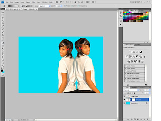
Mirror effect
On this image like most other images it included the very important color balance and eye color heightening but a very long stressful editing, I had never created a mirror effect and all of my process was simply a trial and error which turned out for the better as the results you will see. The mirror was perfectly aligned and the character looks as the caption would express.
Jared
This picture more than the girls surprisingly had much more facial changes, which may have seemed unnecessary but was not, I needed a dark haired man to create a harder looking pose (showing power) and also I needed a guy with blue eyes rather than green as from afar it looks brown and at a less striking pose -eye contact- he also needed a beard to maintain his characters masculinity.
Amarpreet
once again i have added a little special editing to another image unlike the other images this on particular looks old and sepia, also i made sure that the main image still stood out with the bevel filter.
Subscribe to:
Comments (Atom)


