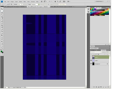
I have created my second contents page, which follows the same theme and apears to be more structured.
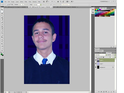
alo i change the fade of my pictures to a half tone effect makeing it more Fun and attracting.
AS media blog..wish me the best!
Hello...what's up?
Sunday, 4 October 2009
NEW CONTENTS PAGE (HIGH QUALITY)
Although this magazine is relatively good there are still some minor errors such as the bleeding text which enters the bar at the side and the UN a lined content list
Magazine
When i was creating it, my computer froze and so it lacks in quality, there fore i hope to be making a second one.(only the second part of the contents page.)
Editing
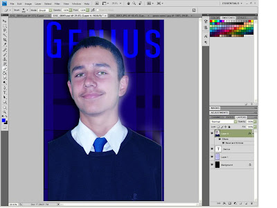
This image was by far the hardest image i had to edit, i had to change numerous features to give this character the intnded effect. i had to give him and artificial lighting which was not given by the light in the actual background.
i lightend his eyes makeing him seem more calm and frendly.
i used many incurrect text effects which i chnaged in the prosses of makeing this.
also the feature that i am most pleased i added to this image was the glowing effect which i added to both the character and background makeing it much more calm and so on.
This image i decided to put in the contents because as it seems, football is the most interesting topic that can be given to the pupil and teachers next to information on school.
before i used this image once more did i edit it, this time giving it a radical blur making it seem even more vibrant and energetic. i also wanted to carry on with the theme so i gave it the same effect the front cover did equip. also towards the right of the image i wanted to give it a clean dirt effect which the sport is, i did not make it brown because it would then be unpleasing and of a different color theme.
from all that i have done there is one last thing that i am particulary dispointed in, my content.
my content though having the correct features such as a credit masthead and the rest fails to have structure making it seem rather unprofessional.


Both of these images welcome any reader; be it student or teacher and parents at home.
It was not a choice on which i preferred but which was more suitable, the male i chose to do this is more smartly dressed than the female below, i did not chose to use the image where he is smiling a little too much because- it is a little more than welcoming but rather mischievous.
It was not a choice on which i preferred but which was more suitable, the male i chose to do this is more smartly dressed than the female below, i did not chose to use the image where he is smiling a little too much because- it is a little more than welcoming but rather mischievous.
These images where taken at a low angle giving height to the character;
although, most of these images did not acuire the perfect pose most where still acceptable as they gave us the image that this character was watching over sumthing and was showing the sign of flight.
Later on we then tried another character pose in which the character then loosens her hair to give a more enchanting pose.
also, with this i gave the image a long shot making her seem even larger.
another reason that one ofthese images was not used was because my hand touched the lens...
Luckily, it took only two trys to get the perfect picture, this picture was good but i did not chose it because the characters seemed to be having trouble finding each others hand. purposely when i took this image i took off the light at the other end, and towards the approaching end. towards US- i lit the light with a soft light, makeing the cuming characters glow.
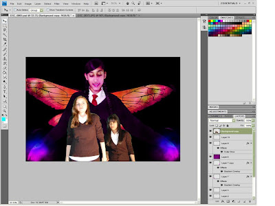
This was actually the hardest picture that i had to edit to fit its topic. this picture is about a school play which is based on a mid summer nights dream. The main character is a fairy-unfortunately i did not know how to give this character a fairy effect; therefore, i started with giving her wings which were as afairys/butterflys-dragonflys Before this i had given this character another wing which were much-much like an egales makeing her seem rather angelic/ evil.
This wing as well as the others where able to fit this character pose, which unlike the rest made her seem as if she was flying or soreing through the stars.
I then tried to give this character fairy dust which we glowing within the purple which filled within her.
I chose the color purple because i had seen from films and reserch that the color most assiciated with magic was the color purple.
At the hand of this character i gave her a purple ball wich was ment to symbolize magic.
while i was giving this character a purple haze i did not ant it to be a plain tint but rather have a glowing effect. i started this off by giving her shinny eyelids and Dark lusious lips.
Because of the story being set in the forests so did the background of this article, i aplied that into this photo but still seemed out of place i messed about with the lighting and effect only to later realise that parts of the background needs to overlap the main images to make it seem in place.
When i added the other picture on this current image they seemed out of plac, why? because they required color balance.
this i did apply as well as a dark circle which formed from the edge engulfing the image; i gave the image this effect because it shows mistery as well as danger which was givven rather from the colour but from the emotion of the characters.
Subscribe to:
Posts (Atom)


