AS media blog..wish me the best!

Hello...what's up?

Saturday, 13 February 2010


Thirdly I compared my front page to another outstanding magazine which appears to be a fashion magazine but closely resembles and R & B magazine for it holds an African American (Beyoncé) once again with strong posture the images is prominent and unlike mine affects the rest of the image to be very strong and IN YOUR FACE, and again holds very distinct text which is fairly rounded and seems very different as it quality is seen and no dithering fortunately this is not to my control and also this magazine holds similar and as I should have done all the colours are of the characters complexion and shows the intended emotion for example the background is a texture which shows a form of distress or power all making the main character very dominant; there is only one aspect in which my magazine defeats this magazine and it is that the title can be said not to be visible but fortunately for this magazine it is very well known and so this is not necessarily a problem.

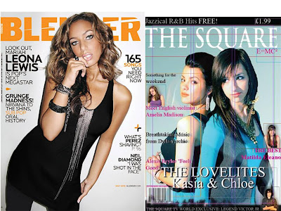
Now what better article to compare my magazine to truly aggravate me but a classical magazine with such grammar I surely will fall to many errors! This magazine is truly grate and grasps the reader making them seem mindless to there endless mind control of great content to great attraction image to format and style and many more!
Firstly this magazine has a very elegant, stylish title though purple is not at all feminine as the character is masculine and can only be seen to be setting mood/ fashion. With great editing the photographer has brought out true emotions from such a static page, this image holds a caption and has a very stylish classic theme making it seem as if it was widrawn from a newspaper with such quality that leaves the page fresh and in place and also is modern as it includes the internet within it leaving a way for the audience to be taken much more after they have grasp all there is to grasp inside and in there extra time continue. Luckily my magazine also holds one of the features which is the quotation though it seems that my magazines quotation is not large enough, also it seems almost that in magazines the colours which you seem to think is a simple colour in the littlest of ways is a gradient making it much neater. Luckily I place a second image on the other side of my magazine for at least in all pages there is an image with very great effect.


The second comparison is between a pop front cover but the cover closely resembles a R & B theme within the way it targets the young audience which mine misses to an extent. The mast head is of a very bright colour which looks to be a little gradient as it approaches the edge and also has a grunge effect which slices the text all VERY EXCITING! And again the main colours are of the characters complexion whist mine is only from the background mostly and the characters are forced to blend with the background unlike most other magazines in which the background is forced to blend with the characters; Again, the text seems to be very round and of great quality keeping the simplicity and leaving the page fresh I was unfortunate as I hade a limited amount of text to use if only I could have used such texts, also the texts were bold which I did not do to make blending easier also! And in the great spaces symbols are used again and this I could have used to attract the audience I also noticed that though my left third holds most of the information it is just as interesting as the other half. Fortunately the magazine I am comparing my magazine to holds a gradient showing all magazines should hold a gradient no matter how visible at least in the lightest of ways. Though I am comparing my magazine to this magazine convection wise my is superior as it hold most if not close to all the convections whilst this magazine misses even the simplest of conventions.


The front page of my magazine is brilliant and as I place it between two different magazines of different genres you will soon see, it surprisingly looks professional, but has some errors which are clearly visible. This magazine is laid out perfectly the following page holds page numbers but the following were missing page numbers. The house colour is of the range of blue – purple/pink but the colours are not simplistic they where made to show a sense of elegance within the ladies as well as leaving it neutral enough to attract males.
From the first comparison with another jazz title it is evident my magazine pursues some of it s features and of course not all besides I picked a random jazz magazine to harden the similarities the two magazines but hold white mastheads which fade smoothly unto the background, similar techniques in which help the image smoothly blend within its background for similar levels and foreground colours; the magazine which I am comparing to my magazine is good and has very different effects also such as the text overlaying the image having similar colour to the mans completion and the main image being a close-up – extreme close-up. The image of the man features an instrument which makes its theme very clear and mine also as the two ladies are seen with very sophisticated jewellery, the man shows a distinction expression which shows power and mixed emotions and my magazine of clear thoughts making it calm, being jazz this magazine is very simple holding only a simple black background whereas mine holds a gradient, and where the could have put PLUS they have instead placed a + symbol.
The jazz magazine follows conventions (sell line) which I have missed or replaced/ moved into the banners which COULD be acceptable, also this magazine holds the perfect slogan which I could have modified and used to my liking for example (The square, UK’s best/ only selling/ Jazzical magazine).

Pages