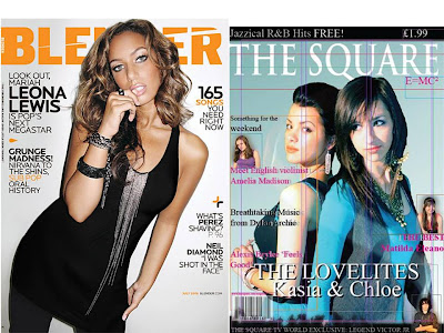
The second comparison is between a pop front cover but the cover closely resembles a R & B theme within the way it targets the young audience which mine misses to an extent. The mast head is of a very bright colour which looks to be a little gradient as it approaches the edge and also has a grunge effect which slices the text all VERY EXCITING! And again the main colours are of the characters complexion whist mine is only from the background mostly and the characters are forced to blend with the background unlike most other magazines in which the background is forced to blend with the characters; Again, the text seems to be very round and of great quality keeping the simplicity and leaving the page fresh I was unfortunate as I hade a limited amount of text to use if only I could have used such texts, also the texts were bold which I did not do to make blending easier also! And in the great spaces symbols are used again and this I could have used to attract the audience I also noticed that though my left third holds most of the information it is just as interesting as the other half. Fortunately the magazine I am comparing my magazine to holds a gradient showing all magazines should hold a gradient no matter how visible at least in the lightest of ways. Though I am comparing my magazine to this magazine convection wise my is superior as it hold most if not close to all the convections whilst this magazine misses even the simplest of conventions.


No comments:
Post a Comment